
When O2 launched in 2014, it called itself an “oxygenated recovery drink.” What’s that? It means it’s infused with oxygen to improve recovery. O2 was marketed to young men who exercise hard, like its founders, Dave Colina and Dan Kim, and it did great in gyms. But it struggled to reach wider retail.
Then it became clear. Retail buyers didn’t understand the phrase “oxygenated recovery,” and consumer research revealed a surprising disconnect: O2’s most engaged customers were women ages 35 to 55 — not young men!
It was time for a change. O2 hired the branding agency We Are Bill. Here’s how they tore the brand down and then built it back up.
Related: Customers Want More Than Just a Product — Here’s How to Meet Their Expectations
Step 1: Define the Problem.
This is the original O2 design. We Are Bill pointed out a few problems: “The logo could be interpreted as a kind of recycling symbol. The waves can communicate water, but also make the logo busy.”
The silver metallic top was also a problem. It’s often associated with energy drinks, which are not perceived as healthy — one of O2’s greatest selling points. It also leans more masculine.
Step 2: Rethink the Vibe.
These are a series of alternative designs from We Are Bill. Here’s their thinking about each can:
1. It’s a simplification of the existing logo. The blues help to communicate hydration. Real ingredients are on the front. Saturated colors communicate full flavor.
2. This was inspired by the Lewis Structure, which is a way of communicating the molecular structure of oxygen. The scientific design helps create a sense of authority.
3. This is the simplest way to communicate “water with oxygen in it.” The drop of water shows it’s a hydrating drink. The scientific structure of O2 lends some authority.
4. This makes the brand slightly more premium. The custom form of the serif “O” is bold and memorable. The “2” nested in the “O” allows for a symmetrical balance.
Related: Why Most Branding Advice Is Wrong — and What Actually Works
Step 3: Refine the Approach.
O2 gravitated toward Option 1, which bears the closest resemblance to their original branding. “We already had several hundreds of thousands of customers drinking O2 somewhat regularly,” Colina says. “So we didn’t want a redesign that confused them.”
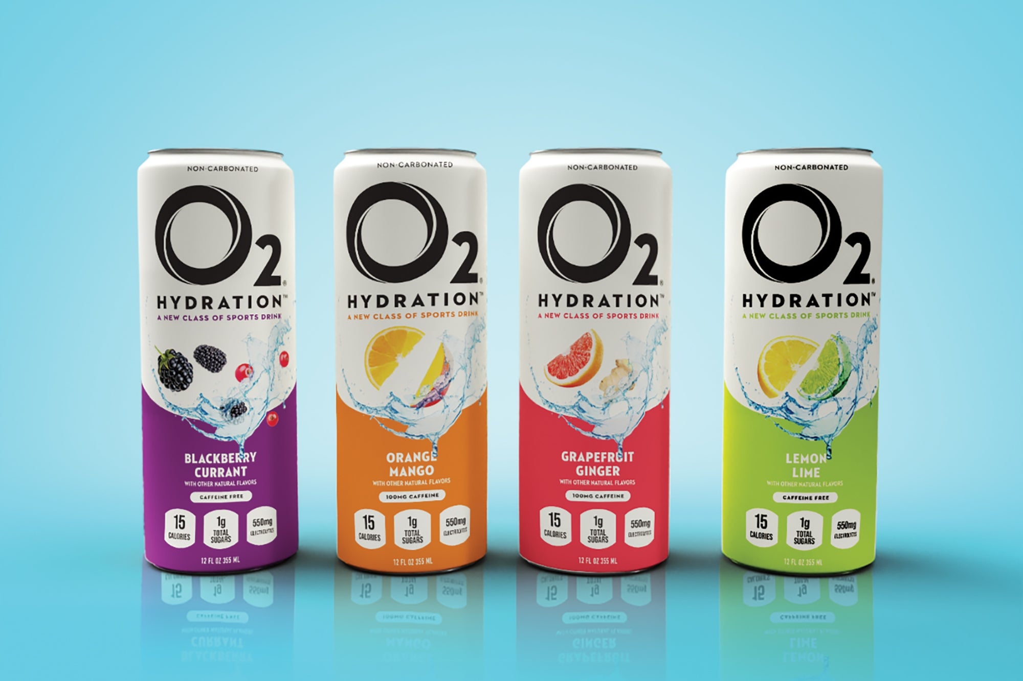
But the changes still marked fundamental, clarifying shifts. They swapped out the “oxygenated recovery” language for the simplicity of “hydration,” and described the beverage as “a new kind of sports drink.” They ditched silver for white to create a sense of clean healthfulness and an approachable premium feel. The bright colors helped communicate the full flavor even though the liquid is clear.
Step 4: Finalize the Decision.
Once the O2 team picked their favorite design, it was refined for further clarity. They added “non-carbonated” at the top of the can, and tweaked the description and nutritional fact bubbles.
Related: 10 Reasons Why Branding Is Important, Even For Startups
They also thought about how the cans would appear in retail. “When you have several cans side by side, the color blocking on the bottom curves up to mimic a wave,” We Are Bill CEO and cofounder Scott Roslyn says.
The final result: O2 began life as an “oxygenated recovery” drink for hyperathletic men, but is now a gender-neutral, flavor-focused, clean hydration drink for everyone. That’s what unlocked growth for O2, which you can now find nationwide at CrossFit gyms, yoga studios, and Life Time fitness clubs.
Join top CEOs, founders and operators at the Level Up conference to unlock strategies for scaling your business, boosting revenue and building sustainable success.
When O2 launched in 2014, it called itself an “oxygenated recovery drink.” What’s that? It means it’s infused with oxygen to improve recovery. O2 was marketed to young men who exercise hard, like its founders, Dave Colina and Dan Kim, and it did great in gyms. But it struggled to reach wider retail.
Then it became clear. Retail buyers didn’t understand the phrase “oxygenated recovery,” and consumer research revealed a surprising disconnect: O2’s most engaged customers were women ages 35 to 55 — not young men!
It was time for a change. O2 hired the branding agency We Are Bill. Here’s how they tore the brand down and then built it back up.
The rest of this article is locked.
Join Entrepreneur+ today for access.
